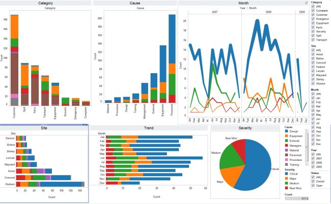
Tableau’s new BI platform has been widely hailed as one of the best self-service BI platforms out there. With a slew of features under its belt, the tool has been vital for BI and Big Data visualisation for companies across scale and industry verticals. The powerful tool lets you do the transition from raw data to analytics in minutes and provides a list of data visualisation capabilities. These help in bridging the gap from the deeply technical of data scientists, to business-oriented reporting for stakeholders and decision makers.
Tableau has gained rapid strides since its inception and has come up as a mature BI and analytics tool. Its newest version, the Tableau 10 has incorporated user feedback and has introduced a UI design overhaul that makes the data visualisation tool easy and intuitive to work with. But is this UI makeover enough to fend off stiff competition from the likes of Microsoft Power BI and Zoho Reports? To know the answer to this question, let’s look at the different features packed into the data visualisation tool. This will help us decide for or against the tool overall.
Learning Tableau
Many developers who transition to Tableau have confirmed that it carries a slightly steep learning curve for them. Though there is no need to have a dedicated BI or IT specialist associated with the job, self- learning on your own might take a bit of time and effort. While large companies can justify the costs involved in this endeavor over the long term, the smaller entities might find it difficult to see the value of the investment.
To help budding BI enthusiasts and professional analysts, Tableau has set up a comprehensive online learning community. The resources on this ecosystem include social media groups, forums, technical support, discussions, Tableau Community, Tableau bloggers and galleries on visualisation. This will lessen the amount of time taken by the developer / analyst to start becoming productive using the system.
An interesting point to learn is Tableau’s support for web data connectors. This functionality helps developers to design custom data connectors that can link to any web source like Facebook, or Google Docs. Another noteworthy point is the collaboration option provided by the server version and online version. Both roles and schedules can be subjected to a micro level of analysis.
Our verdict –
While the learning curve is indeed higher than other BI tools, once mastered, it will offer a host of avenues to improve your RoI with time-saving functionalities and powerful performance.
Set up and configuration
In our testing, we also assessed the ease of setting up of the tool and its configuration to our existing systems. To start off, you need to import data. If you don’t see data connectors anywhere on the new user interface, don’t worry. Tableau has chosen to name them as ‘drivers’. One area that we found interesting was the amount of compatibility offered by the tool with Windows as compared to Mac. With Mac, Tableau data connectors can connect to only MapR, Hadoop or HortonWorks. But with Windows, the connector functionality is extended to other third party applications like MapReduce and BigQuery too.
Another quirky thing we noticed was the absence of templates for commonly used visualisation elements. These include radars, donuts, and speedometers. If analysts need to use them, they cannot do so straight away; they have to do some workaround to use these elements. However the presence of drag and drop functionality on the user interface helps execute the tasks in a quicker way.
A good point here is the ease of use with Big Data and cross-relational querying, even when the volume of data starts reaching higher loads. This stability at high volume loads results in the overall reliability of the tool to operate well even when the company data and records swell up.
Our verdict –
The setup and configuration is easy, but with the functionalities missing essentials like design elements, and a complex security setup, it might not be an automatic choice for large scale enterprises. Here BI solutions are designed and shared widely amongst the technical as well as business use cases and Tableau might fall short of expectations.
Data visualisation
The advent of technological advancements has made data visualisation more interactive and more powerful than before. The domain has moved from being confined to an Excel worksheet to an entirely separate tool designed specifically for the purpose of data visualisation. And it is in this space that Tableau really shows its forte as the world’s leading BI and data visualisation tool. We aren’t the only ones saying so. Industry acknowledgement in the form of Gartner too corroborates this view. Gartner’s Magic Quadrant for Business Intelligence and Analytics Platforms report highlighted Tableau as the leader in 2015.
Tableau has made data visualisation simpler and more impactful. The tool helps to view data from multiple angles and slice and dice the numbers for insight generation. It satisfies the highly mission critical KPI of a good BI software – i.e. providing the right kind of information to the right people at the right time. Business users gain control to create and publish dashboards as well as distribute it to stakeholders, clients, or regulatory agencies. It provides various avenues to show the data with different views. Business analysts can easily apply filters and do a granular level of analytics. They can view trend lines and generate forecasts to give direction to the business.
With tableau, business analysts can easily accomplish the rigours of converting mere numbers into a compelling story. With its on-the-fly querying, charts go beyond static presentation elements to real-time visual windows for a given situation or question. This is achieved mainly through Grouping and Filter functions. While filter allows you to work with data based on certain conditions, grouping allows you to combine multiple records logically into a particular group for more analysis.
The only disadvantage that works against the data visualisation capabilities of Tableau is its steep learning curve. We needed to go back and forth multiple times to get a hang of the data visualisation elements, components, and user interface presented to us by the tool. If you can afford to invest a bit of time of your human resources to come up to speed with this aspect, then rest assured, the value provided by data visualisation from Tableau will be absolutely worth the effort.
Our verdict –
The immense ease of usage and powerful outcomes associated with the data visualisation section of Tableau far outweighs the minor hiccups like the steep learning curve and time investment needed to unleash the full power of the tool.
Pricing
Tableau is available in five distinct flavors – Tableau Desktop, Tableau Server, Tableau Online, Tableau Reader, and Tableau Public. The pricing follows the below slabs –
- 1st year – Either $1000 for one desktop user or $3000 for one desktop user bundled with up to 5 consumers along with cloud support
- A 3-year package starts at $2000 for single desktop user or $8000 for single desktop user with up to 5 consumers on cloud
- Additional connections can be had at $1000 for the first year or $2000 for three years.
[spacer height=”10px”]
While the pricing looks reasonable, when compared with is rivals like Microsoft Power BI, the pricing is higher. Also, consider the fact that Microsoft throws its enormous weight behind the BI solution with full-fledged Office 365 support. This makes the Microsoft solution a far better proposition than Tableau.
Our verdict –
The best way to improve adoption without feeling too much of a cost pinch will be to start with the free/trial version. This will help you understand how the tool behaves with your existing systems, file formats, and processes. Once you are satisfied, you can move to the Desktop version and build your BI workspace from there.
Parting thoughts
From amongst all the BI tools we have worked with, we found Tableau to be truly mature self-service BI tool. The sleek design and its ability to keep in line with evolving trends have made it a favourite amongst BI and analytics experts all over the world. With a host of user-friendly features, there are many functions not commonly available in competitive products.
We find it to be a remarkable data visualisation tool on multiple criteria. It is true that the tool is plagued by a few niggles like an expensive price tag, glaringly missing features, and a confusing product line. But if we keep aside these factors, there is really nothing to fault the Tableau desktop tool. Lastly, for the first time users, Tableau offers a free trial which they can upgrade to the full-fledged software if they like what they get with the free trial.
Planning to acquire data from the web? We’re here to help. Let us know about your requirements.


