A dataset can be analysed in multiple ways. Exploratory data analysis process is one of the most widely used methods among the available solutions. In simple terms, the process involves the extraction of certain data points from the dataset and generating graphs. These graphs are then analysed visually to find trends or patterns. The visualisations also help in backing up claims or inferences to enable quick decision making. The outcomes of these decisions are as follows–
Data backed business decisions
Decisions on the data processing and consumption.
What is the role of exploratory graphs in data analysis?
Exploratory graphs or visualizations help give a clear picture of the data. Individuals are able to understand parts of the data through a single snapshot without the need to go through the data manually – an exercise that could take hours, otherwise! The step also acts as a precursor to decisions like – what type of models can be built or how the existing data can be processed, or even what type of business questions can be answered through understanding data.
Performing exploratory data analysis
Python and R are the most common languages for data analysis. Python is the most popular among developers, thanks to the availability of easy to use 3rd party libraries like pandas, seaborn and matplotlib.
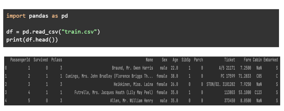
We will be using the libraries mentioned above, to explore the data provided in the dataset- Titanic- Machine Learning from Disaster by Kaggle. In the very first step, we print the first few rows of the dataset to get a feel of how the data looks.
Next step involves printing the data types of every column. The object columns are strings, the float columns contain decimal values whereas the int columns contain numbers.
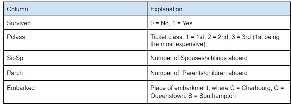
In case you are confused about a few columns which may not be self-explanatory, here’s a table that we obtained from Kaggle’s website that explains these columns better –
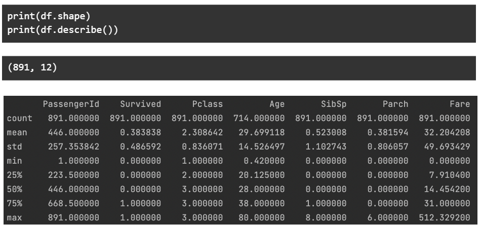
To further dive into the data, we check the shape of the data – number of rows and columns. We also print the major statistical data points related to every numerical column.
An important aspect of these datasets is what percentage of the data is empty. Here we print the number of null entries for every column –
In case you want to remove all the rows where a particular column has an empty value, you can use something like the code below. Here we simply remove all the rows where ‘Age’ is empty.
Next step involves creating visualizations out of different combinations of columns from the dataset at hand. We will be doing –
Univariate analysis – Analysis of a single column. Bi-variate analysis – Analysis of two columns (usually one vs another). Multivariate analysis – Analysis of three or more columns.
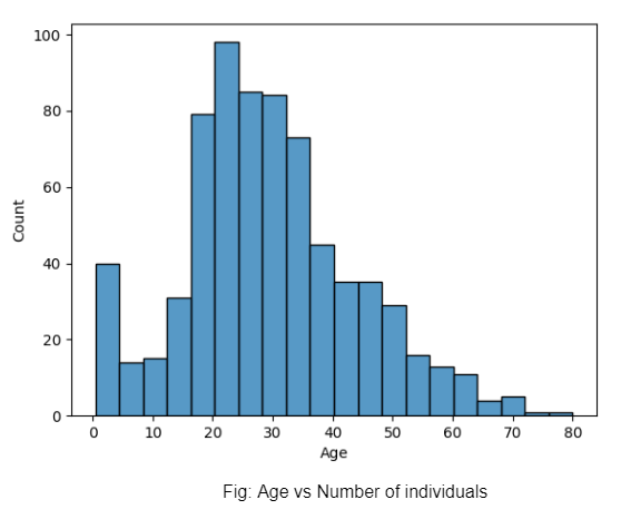
So what is the role of exploratory graphs in data analysis here? In the first example, we can notice how many individuals of each age group boarded the Titanic based on our dataset.
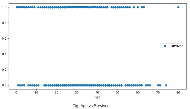
Next, we plot the age vs survived graph and realise that the age of a person did not decide whether he or she survived the wreck.
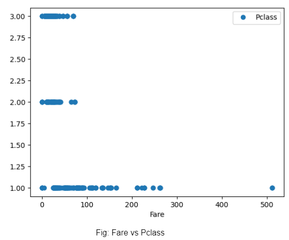
We plot the fare vs the class of tickets and discover that while the 1st class tickets were charged higher in some instances, all tickets could be bought cheap (probably if bought early on). However, prices of tickets for 3rd and 2nd class are almost similar..
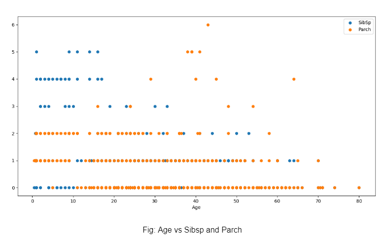
The only multi-variate graph of this exploration is plotting on Age vs SibSp and parch for coming to the conclusion that younger individuals had a higher chance of having more siblings which probably led to a higher SibSp. Parch was higher mostly in the later ages, probably due to individuals having children. Most have a Parch of just 1 or 2, indicating the presence of either one parent or both.
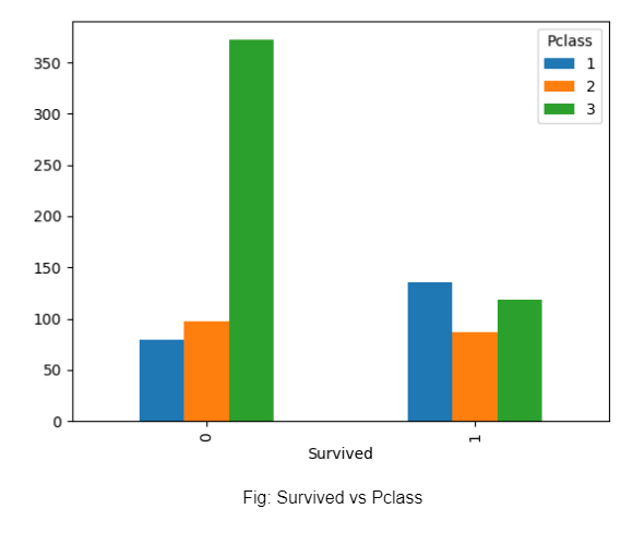
Plotting the survived vs the class, the number of those that survived is almost the same across the classes, whereas the number of deaths is highest for the 3rd class. This may be due to the 3rd class having the largest count.
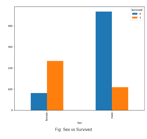
In the last graph, we plot gender against survived, and realise that compared to men, a larger percentage of women had survived. This could be because women were asked to board lifeboats first.
Exploratory data analysis process might look like a lot of dark marks on a page, but visualizations help bring out the beauty and the mystery hiding in the data. This is why data scientists and data analysts use exploratory analysis as a primary means to assess data. This is done before designing data pipelines or ETL systems. Visualizations help consume data more easily, irrespective of the source and the problem statement at hand.