


**TL;DR**
Most teams assume data quality means clean spreadsheets, but AI pipelines need something much deeper. When models depend on scraped or web-scale data, the three metrics that make or break performance are freshness, bias, and completeness. This blog breaks down how each metric works, how to measure it, and how to build a reliable data quality foundation for any AI-ready infrastructure.
What Teams Often Miss About Data Quality Metrics
Teams often notice discrepancy in metrics in small, nagging ways. A pricing model suddenly recommends discounts on items that went out of stock yesterday. A sentiment classifier swings positive because one source dominated the feed for a week. A categorization pipeline starts mislabeling items because a section of the data quietly vanished.
That’s why data quality metrics matter much more than people admit. They’re not checkboxes; they’re the guardrails that keep an AI system honest. Freshness tells you whether your dataset reflects the world today, not last week. Bias shows where your data leans and why your model keeps leaning with it. Completeness reveals what’s missing because missing data, even in small pockets, can distort an entire pipeline.
Think of this piece as a practical guide for teams that already know data matters, but now need to understand how to measure its trustworthiness before feeding it into anything “AI-ready.” We’ll break it down piece by piece, clear, simple, and grounded in real workflows.
Why Data Quality Metrics Matter for AI Pipelines?
Most AI teams talk about “good data” as if it is a single trait. In reality, quality is a cluster of conditions that decide whether a model learns the right patterns or picks up noise that looks like insight. When your data originates from the web, these conditions shift constantly. AI models are sensitive to subtle distortions. They amplify them during training. They treat them as truth during inference. This is exactly why data quality metrics matter. They help you understand the texture of your dataset before it enters any pipeline.
Three types of issues tend to surface often. You will see them in almost every web-sourced dataset, regardless of industry.
First issue: Lagging freshness.
When the data does not represent the latest market conditions, models respond with outdated predictions. This shows up in pricing recommendations, demand forecasting, classification tasks and even customer sentiment analysis.
Second issue: Structural or demographic bias.
Web data is rarely neutral. Certain categories, brands, regions, or customer voices dominate more than others. If you do not notice these skews early, your model will learn them as rules.
Third issue: Gaps in completeness.
Missing attributes, partial records, or weak coverage across sources create blind spots. AI systems cannot learn what the data never showed them.
Get structured Booking.com review datasets to track sentiment, identify service gaps, and benchmark competitors.
What Makes Data Fresh in an AI Context?
Most people assume freshness is simply about having “new data.” In practice, freshness is about alignment with real-world change. AI models behave differently when trained or powered by data that reflects what is happening today rather than what happened last week or last quarter. Web data shifts quickly. Prices move. Listings expire. Reviews spike overnight. Competitor pages change silently. If your datasets do not keep pace, your model starts learning from a world that no longer exists.
Here is the simplest way to think about freshness. It measures the time gap between a real-world update and the moment your pipeline captures it. That gap plays a major role in how accurate your model feels in production. Freshness usually has three layers.
Collection frequency: This is the rhythm of your extraction. Some teams refresh data hourly. Others once per day or per week. The right frequency depends on the volatility of the source. Pricing data, for example, ages much faster than product descriptions.
Propagation speed: Even if your crawler collects the data quickly, delays can appear inside your transformation or validation steps. Propagation speed measures how fast raw data becomes usable data that is ready for training or inference.
Staleness tolerance: Not all data becomes harmful at the same pace. A two hour delay for travel pricing data can ruin a forecasting model. That same delay might be fine for real estate catalog data. Defining tolerance helps teams set meaningful thresholds rather than guessing.
A useful way to work with freshness is to measure it continuously. Track the timestamp of each record. Check the ratio of “current” records to older ones. Watch how quickly a change in the source appears in your dataset. These measurements tell you whether your data pipeline is operating in sync with reality or lagging behind it.
Measuring Freshness in Practice
Freshness sounds straightforward, yet most teams do not measure it with enough precision. They check timestamps occasionally or rely on assumptions about how often the data “should” update. This creates blind spots. If you want an AI pipeline to behave reliably, you need a more grounded way to evaluate how current your data really is.
A practical approach begins with understanding the different touchpoints in your data flow. Web sources update at irregular intervals. Your crawler schedules follow a different rhythm. Transformation and validation layers introduce their own delays. Measuring freshness means looking across the entire chain rather than only at the moment of extraction.
Here are the most useful indicators for real-world freshness.
Source update detection: Track when the original website last changed. If your extraction logic misses that change for several cycles, it signals a freshness gap. Some teams use change detection scripts or lightweight probes to monitor critical pages.
Record age distribution: Instead of checking a single timestamp, inspect the spread of ages across the dataset. A healthy dataset shows a tight cluster of recent timestamps. A wide spread suggests uneven updates and inconsistent coverage.
Coverage decay: Sometimes the data remains technically fresh but certain categories or attributes stop updating as frequently. Monitoring how often each field changes over time reveals slow decay that eventually affects completeness.
A continuous freshness score adds transparency. Teams often calculate this as the percentage of records updated within a target window. When this score dips below the tolerance you defined earlier, it becomes a clear signal to adjust crawler frequency, fix a pipeline delay, or recheck source patterns. Freshness is not simply about speed. It is about synchronization. When your pipeline stays aligned with the pace of the web, the model receives inputs that represent the world accurately.
Understanding Bias in Web Data and AI Pipelines
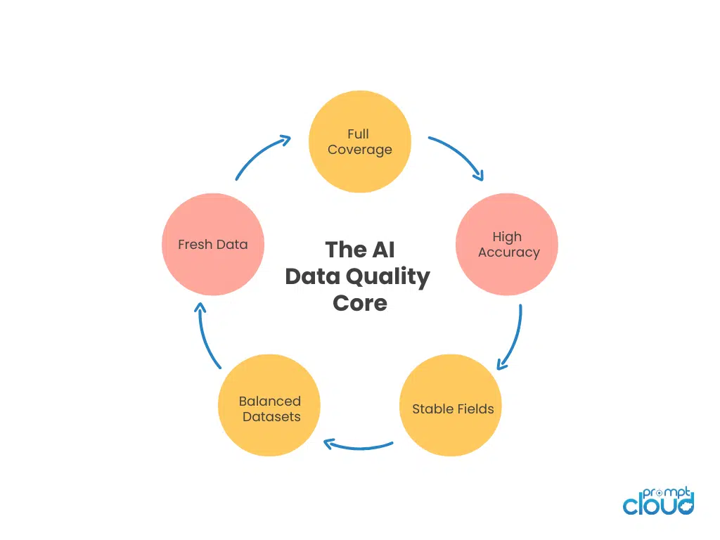
Figure 1: Core data quality components that shape AI reliability.
Bias is one of the most misunderstood data quality metrics. Teams often treat it as a philosophical concern instead of a practical one, yet every AI model reflects the skew of the data it sees. When your dataset is sourced from the web, bias shows up quietly. Certain brands dominate more categories. Some regions generate more reviews. Specific product types receive more visibility. If you do not measure these patterns early, the model learns them as ground truth.
A simple way to approach bias is to treat it as imbalance.
- Imbalance in representation.
- Imbalance in frequency.
- Imbalance in emphasis.
Even small distortions can reshape outcomes. A recommendation model will promote what it saw most often. A classifier will mislabel categories it barely encountered. A forecasting model will depend heavily on dominant patterns while ignoring weaker signals that matter in production.
Table 1: Common Types of Bias in Web Data
| Bias Type | What It Looks Like in Raw Data | How It Affects AI Models |
| Category Bias | Overrepresentation of certain categories or brands | Model prefers dominant categories and delivers skewed classifications |
| Source Bias | Data captured more often from a specific website or marketplace | Model adapts to the patterns of one source and performs poorly elsewhere |
| Geographic Bias | Heavy coverage from certain regions and weak coverage from others | Forecasting and sentiment outputs become regionally distorted |
| Temporal Bias | Data spikes in specific periods while other windows show gaps | Models misinterpret seasonality or learn time-restricted behavior |
| User Bias | Reviews or user input dominated by a specific demographic | Models reproduce the tone and preferences of one group over another |
Bias is not always harmful. Some bias is natural and reflects the structure of the underlying market.
A reliable bias evaluation starts with questions like:
Which categories appear most often?
If the model sees certain labels ten times more frequently than others, expect prediction skew.
Which sources dominate the dataset?
Some marketplaces update more aggressively than others. This inflates their influence in training data.
Which customer voices appear repeatedly?
A single vocal user group can tilt sentiment, even if the broader audience feels differently.
Which geographic zones generate the most content?
A dataset heavy in North American reviews cannot reliably power global sentiment models.
When teams evaluate bias systematically, the aim is not to remove all skew. The aim is to understand it, account for it, and adjust the pipeline so the model does not amplify distortions quietly in the background.
Measuring and Quantifying Bias
Bias becomes manageable only when it is measurable. Most teams try to “feel” their way through it, which usually results in vague assumptions and inconsistent outputs. Start by examining representation patterns. Look at how often each category, brand, region, or sentiment appears in the data. Large gaps signal imbalance. After that, compare patterns between sources. Some websites produce richer information or more frequent updates, which can quietly dominate your dataset.
A good bias measurement framework uses structured views rather than loose interpretive notes. Tables make distortions obvious and help teams communicate them clearly.
Table 2: Practical Indicators for Bias Quantification
| Indicator | How to Measure It | What It Reveals |
| Category Distribution Ratio | Count records per category and compare against expected market proportions | Highlights category dominance or underrepresentation |
| Source Contribution Share | Percentage of data contributed by each source | Shows whether one site or marketplace is overpowering others |
| Sentiment Balance Index | Ratio of positive to negative to neutral reviews | Identifies emotional skew that can distort sentiment models |
| Geographic Spread Score | Records grouped by region and normalized by population or market size | Exposes regional bias and missing geographic coverage |
| Temporal Stability Check | Distribution of records across time windows | Detects seasonal or time-bound distortions caused by incomplete crawling |
Quantifying bias is not about forcing the data to look perfectly balanced. Markets are rarely symmetrical. The purpose is awareness. When you know the degree of imbalance, you can design the model and pipeline around it.
A practical workflow usually includes these steps.
Step one: Visualize category or label distribution.
Bar charts, pivot tables, or simple counts show whether the dataset has an uneven shape.
Step two: Compare multiple sources.
If one site supplies more than half the records, consider weighting or expanding coverage.
Step three: Monitor sentiment proportions.
A sharp tilt toward positive or negative reviews may indicate sampling issues rather than true market behavior.
Step four: Review geographic representation.
Look at where your data comes from and whether those regions match your intended prediction scope.
Step five: Validate time windows.
Ensure each time period carries enough data. Otherwise, models learn artificial seasonality.
Why Completeness Is the Hardest Data Quality Metric to Get Right
Completeness sounds simple. Most people define it as “having all the data,” but in practice, completeness is about having all the right data, across all the fields that matter, at the level of depth and consistency that your model needs. This is where teams struggle. Web data comes from pages that change formats. Fields appear and disappear. Some attributes update daily while others remain static. Even a small hole in one part of the dataset can distort the entire downstream pipeline.
Completeness problems usually hide inside the structure of the data. You do not always notice them in early exploration. Records look full at a glance, yet critical attributes are missing under the surface. For example, product listings might have consistent titles but inconsistent price fields. Review pages might contain text but lack timestamps. Job listings might show job titles but omit seniority or required skills. These gaps do not seem dramatic, but they weaken the signals that AI relies on.
Here is why completeness is so difficult to maintain. It depends on factors outside your control. Source websites evolve. Marketplaces redesign pages. Platforms throttle content or shift certain attributes behind asynchronous calls. If your crawler or extraction logic does not adapt immediately, large portions of your dataset become patchy.
Completeness also varies across dimensions. A dataset may have full coverage for one category and thin coverage for another. It may contain every record for a specific date range but miss deep attribute-level details. It may include many rows but lack the variety needed to represent real-world diversity.
Table 3: Dimensions of Completeness in Web-Sourced AI Data
| Completeness Dimension | What It Refers To | Why It Matters |
| Record Coverage | How many total entities you captured compared to the expected population | Missing records lead to blind spots in training data and weak model generalization |
| Field Coverage | How consistently each attribute is populated across all records | Gaps in key fields reduce the effectiveness of feature engineering |
| Depth of Information | Level of detail collected for each entity such as specs, metadata, or nested fields | Richer depth improves model resolution and reduces noise |
| Temporal Coverage | Continuity of data across time windows | Missing periods distort trend lines and seasonal learning |
| Source Variability Coverage | Range of websites or sources included | Low diversity causes models to overfit to one platform’s patterns |
Completeness is challenging because it is multidimensional rather than binary. A dataset can be complete in terms of record count but incomplete in attribute richness. It can contain detailed fields but only for one region. It can provide excellent monthly snapshots but miss daily fluctuations that affect forecasting models. Teams usually notice completeness issues late. This happens during feature engineering, when missing fields break pipelines or require manual patching. It also appears during model evaluation, when the model performs well in one slice of data but collapses in another because that segment was never fully captured.
How to Evaluate Completeness Step by Step
A practical completeness review starts with record-level checks. From there, you dig deeper into fields, patterns, and time windows.
Step-by-step completeness workflow
Step one: Validate entity coverage.
Count how many unique products, listings, reviews, or jobs appear in your dataset. Compare that number to the expected population. Sharp drops or unexpected gaps indicate missing slices of the market.
Step two: Inspect field-level consistency.
Look across critical attributes such as price, brand, rating, date, category, or skills. If a field is missing in more than a small percentage of records, the dataset may not support downstream modeling tasks that rely on that attribute.
Step three: Examine depth of information.
This involves checking not only whether a field exists but how detailed it is. Some fields may contain placeholders or incomplete segments. A field that exists but contains thin information still weakens model training.
Step four: Review time continuity.
Plot your dataset across time windows. Missing weeks or months distort temporal patterns and can trick models into learning false or incomplete seasonality.
Step five: Compare source variation.
Make sure the dataset represents multiple platforms, sellers, or regions. Without this diversity, the model learns from a narrow worldview and fails when confronted with broader conditions.
Table 4: Evaluation Steps and What They Reveal
| Evaluation Step | What It Checks | Typical Insights Gained |
| Entity Coverage | Count and presence of complete records | Identifies missing sections of the market or population |
| Field Consistency | Attribute-level completeness | Reveals weak feature representation or schema drift |
| Depth Review | Strength and richness of information | Detects thin or low-quality fields that weaken training signals |
| Time Continuity | Coverage across time windows | Highlights missing periods that distort seasonality or trends |
| Source Comparison | Diversity of input sources | Shows if the dataset leans toward one platform or region |
A completeness review becomes stronger when performed at two levels. The first level checks raw extraction output. The second level checks the validated, transformed dataset. Differences between these levels signal whether the issue lies in crawling, parsing, schema mapping, or validation rules.
Completeness is less about “filling gaps” and more about knowing where the boundaries of your dataset are. Once you know those boundaries, you can plan your AI pipeline with intention. You can decide which data is trustworthy, which fields need enrichment, and where additional crawling or source expansion is required. This step-by-step approach gives teams a clear view of the data’s structural integrity. With that clarity, AI systems become more predictable, easier to debug, and far more reliable.
Bringing Freshness, Bias, and Completeness Together for AI Reliability
Most teams look at freshness, bias, and completeness as separate concerns. They audit them independently. They assign different owners. They fix issues one at a time. This works at a small scale, but once your AI pipeline grows, these metrics start interacting in ways that shape the entire system. Reliability comes from understanding how these dimensions influence one another.
Freshness affects bias. If one source updates more frequently than others, it naturally becomes overrepresented. That imbalance eventually becomes a form of source bias. Models then learn the rhythm of one platform instead of learning the broader pattern.
Bias affects completeness. When a dataset leans toward certain categories or regions, completeness appears stronger than it actually is. You might have full coverage of a specific slice, but poor coverage of everything else. The dataset looks rich on paper yet incomplete for real-world inference.
Completeness affects freshness. A dataset can update regularly but still be incomplete if certain attributes stop appearing or if some categories remain thin. Freshness alone does not guarantee a dataset is whole. Both metrics need to be aligned.
These connections matter because AI pipelines depend on stability. When one metric slips, the others often follow quietly. A small coverage gap becomes a larger imbalance. A few stale fields become a slow shift in representation. Within a few weeks, the model begins drifting away from the environment it is meant to understand.
Here is a simple way to see how the three metrics work together.
Table 5: How Data Quality Metrics Influence Each Other
| Metric | How It Interacts with Others | Outcome If Ignored |
| Freshness | Outdated records inflate bias toward sources that update more often | Model learns patterns that no longer match real-world conditions |
| Bias | Skewed representation creates blind spots that appear as completeness issues | Predictions become unreliable for underrepresented segments |
| Completeness | Missing fields weaken the signals required to detect bias or validate freshness | Models behave inconsistently and performance becomes harder to explain |
When teams evaluate these metrics in isolation, they solve symptoms rather than root causes. Reliable AI requires a more integrated approach. The three metrics work best when monitored together, reviewed together, and improved together. This creates a feedback loop that strengthens the entire pipeline.
A healthy pipeline shows three signs. Data arrives quickly and consistently. Representation stays balanced across categories, regions, sources, and sentiment. Coverage remains full across both records and attributes. With these metrics aligned, AI systems behave more predictably. They generalize better. They drift less. They become easier to troubleshoot and far more trustworthy.
Building a Data Quality Monitoring Framework
A data pipeline becomes reliable only when its quality controls operate continuously rather than during occasional audits. Freshness, bias, and completeness change every time the source changes. This is why teams need a monitoring framework that runs quietly in the background and shows early signals when the dataset begins to drift. The goal is to notice issues before they reach your training environment or break a production model.
A strong monitoring framework treats data quality like observability.
- You track indicators.
- You store baselines.
- You alert on deviations.
- You review patterns regularly instead of reacting only when something fails.
A practical framework usually includes three components.
The measurement layer: This layer calculates freshness scores, bias ratios, completeness percentages, and field level coverage. It also captures trends over time rather than taking a single snapshot.
The expectation layer: This defines what is acceptable. For example, the percentage of records updated within the last twenty four hours, or the minimum number of fields that must be populated for each entity. Expectations set boundaries that prevent silent drift.
The alerting layer: This sends signals when values fall outside the expected range. These alerts do not need to be complex. Simple rules such as a drop in daily updates or a sudden rise in missing attributes can highlight early problems that require attention.
A monitoring framework works best when the three quality metrics are connected.
- If freshness declines, the alert should encourage checks on source bias.
- If completeness drops, the system should prompt a review of schema changes.
- If bias increases, the team should investigate coverage and time windows.
Figure 2: Continuous data quality monitoring loop for AI-ready pipelines.
A good framework does not replace human judgement. It simply gives teams better visibility into the actual condition of the data. Over time, this visibility leads to more stable pipelines, fewer surprises during training, and far more confidence when deploying AI systems in real environments.
How Data Quality Metrics Strengthen Your AI Pipeline
Data quality metrics decide whether an AI pipeline becomes stable or unpredictable. Even the most advanced models depend on inputs that reflect the world with accuracy and depth. When freshness slips, models learn from outdated patterns and respond with stale predictions. When bias grows unchecked, the system tilts in directions that distort real behaviour. When completeness weakens, the model loses the texture it needs to generalize beyond narrow slices of data.
A reliable AI system comes from understanding how these three metrics interact. They are not separate checkboxes. They shape one another and influence how your entire pipeline evolves over time. When measured continuously and reviewed together, they help you understand the true condition of your dataset long before it reaches your training environment.
This creates a level of transparency that teams rarely get from raw exploration. It allows better planning, faster debugging, and stronger performance under real world demands. AI becomes easier to trust because the data behind it is no longer a mystery. It is visible, measurable, and aligned with the decisions your model needs to make.
A strong monitoring framework closes the loop. It gives you consistent signals, clear expectations, and early warnings when something begins to drift. With this structure in place, you move your AI pipeline from reactive to proactive. Over time, your models become more stable, your predictions become more dependable, and the entire system becomes easier to scale with confidence.
Further Reading From PromptCloud
Here are four relevant articles that connect well with this topic.
- Learn how orchestrated agents improve data pipelines in multi agent scraping:
https://www.promptcloud.com/blog/what-is-multi-agent-scraping/ - See how structured extraction works in real scenarios with a WordPress scraper:
https://www.promptcloud.com/blog/extract-wordpress-blog-with-automated-wordpress-scraper/ - Understand how HR teams use data analytics for effective recruitment decisions:
https://www.promptcloud.com/blog/data-analytics-for-hr-how-to-make-effective-recruitment/ - Explore how richer datasets improve outcomes with real estate data analytics: https://www.promptcloud.com/blog/the-benefits-of-real-estate-data-analytics-using-big-data/
For a deeper view on data governance principles that support AI readiness, you can read the World Economic Forum’s framework on responsible data infrastructure.
Get structured Booking.com review datasets to track sentiment, identify service gaps, and benchmark competitors.
FAQs
1. Why do AI pipelines fail even when the data looks clean?
Because cleanliness and quality are not the same. Data can be free of errors but still lack freshness or depth. It can also show skewed representation or missing fields that look harmless at a glance. These gaps influence how a model learns and how well it performs in new situations.
2. How often should teams measure data freshness?
Freshness should be checked every time new data arrives. This is especially important for web sourced datasets, where updates happen irregularly. A frequent check helps you see delays before they affect model output and prevents silent drift.
3. What is the easiest way to detect bias in a dataset?
The simplest approach is to review how categories, regions, or sources are distributed. If one segment appears much more often than others, the dataset contains built in imbalance. Tracking these distributions over time gives a clear view of how bias enters the pipeline.
4. Is it possible to achieve perfect completeness?
Perfect completeness is rare. Websites change structure and certain fields become unavailable without warning. The goal is not perfection. The goal is visibility and early detection. Once you see where the gaps are, you can decide whether to enrich the dataset or adjust the model.
5. Do all three metrics matter equally for every AI system?
Their importance depends on the application. A real time forecasting model depends heavily on freshness. A classification model depends more on completeness and bias balance. Even so, all three metrics support overall reliability, so they should be monitored together.