


Table of Contents
show
“Data is the new soil. Because for me, it feels like a fertile, creative medium. Over the years, online, we’ve laid down a huge amount of information and data, and we irrigate it with networks and connectivity, and it’s been worked and tilled by unpaid workers and governments. But it’s a really fertile medium, and it feels like visualizations, infographics, data visualizations, they feel like flowers blooming from this medium.…. interesting things can appear and different patterns can be revealed.”
This edited excerpt from an extremely popular TED Talk titled “The beauty of data visualisation” by journalist-cum-data-detective David McCandless, metaphorically explains the power and magic of data visualisation, which may be the only practical way for us to ingest, digest and appropriately use all the data that we are bombarded with.
Taking the Complexity out of Data
Data visualisation is essentially one of the most powerful ways of simplifying complexity associated with volumes of data. Considered the modern equivalent of visual communication, the term “data visualization” refers to the “creation and study of visual representation of data, meaning information has been abstracted in some schematic form, including attributes or variables for the units of information.” Efficient and clear communication of data with the use of various types of information graphics is the principal objective of data visualisation.
The old, and perhaps clichéd, adage that a picture is worth a thousand words is upheld with data visualisation. It’s got to do with how the human brain processes information. Visuals provide context and perspective that an assortment of numerals can’t. As with almost every aspect of life, context and the inherent relativity that it offers is extremely critical to correctly interpret the story the numbers tell and make well-informed decisions.
Key Aspects of Effective Data Visualisation
Effective data visualisation is akin to effective storytelling. There is obviously a great deal of science in it, but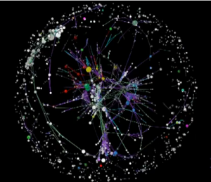 what makes it so beautiful and compellingly useful is the element of art inherent in it. It is a manifestation of a deep understanding of numbers, those who use numbers, as well as the creativity and aesthetic sensibilities of the data visualiser.
Data visualisation essentially has two goals- explanatory and exploratory, as stated in an excellent whitepaper that dissects the principles of this discipline quite elaborately. When the objective is explanatory in nature, one starts with a premise or would like to take the audience down a specific path.
On the other hand, data visualisation is also used with the goal of exploring large data sets for better understanding.
The process of data visualisation, particularly those with the explanatory objective, can be broken down to into four essential steps, though it might be an over-simplification.
- Clearly understand the layers of data being visualised
- Define what is being visualised and what needs to be communicated
- Evaluate the target audience and figure out how it interprets data
- Create visuals that explain the data clearly and simply to the audience
Benefits to Businesses… and beyond
According to Edward Tufte, a data visualization expert, ‘Graphical excellence is that which gives to the viewer the greatest number of ideas in the shortest time with the least ink in the smallest space.’ No wonder visualisation has become so vital to businesses of all types.
The key benefits certainly lie with the speed and clarity that it lends businesses in understanding challenges and opportunities. The trends and patterns that become apparent when information is presented graphically help businesses to identify the right priorities and focus on them, while cutting down on a lot of clutter or “noisy” data.
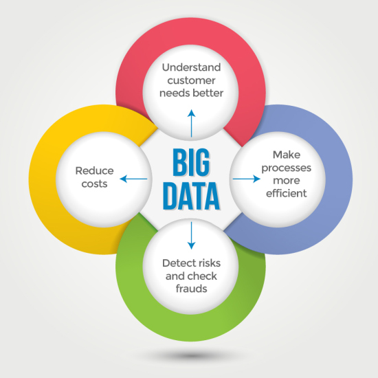
By getting the data in a comprehensible format to the right people, data visualisation helps cut down the response/ turnaround time and pave the way for faster and better decision making. Another benefit that doesn’t get as talked about is how visualisations can facilitate better collaboration between disparate teams in an organisation.
It is not commercial organisations only that benefit from data visualisation; it is equally enabling in the government/ public sector. For example, the Mayor of London, Boris Johnson, is a great advocate of using this technique to communicate meaningful information with the public.
It will not be surprising if the Indian government’s current push towards use of the digital medium, e-governance and direct communication with the masses will result in a more conspicuous use of data visualisation.
Balance between Functionality and Visuals
It is important to remember that the visualisation element is just one of the important elements of Big Data. Achieving the fine balance between the functionality and the visual representation is critical. Ultimately, it is the data and what it means that is of paramount importance. If the graphical representation- no matter how good it is visually fails to adequately highlight the most relevant aspects of the data, it will eventually defeat the key purpose.
The best results will be achieved when data scientists, data analytics tools and data visualisation experts operate in a perfectly synchronised manner.
See how to become a data scientist in 8 steps!
Image Credits: stephenslighthouse