


Data visualization refers to the presentation of data in a graphical format. Traditionally, data visualization has existed in the form of charts and maps. The Periodic Table is one of the best uses of data visualization that reveals hidden relationships and makes the classification of chemical elements easy to understand.
Visualizations are a means of encoding ideas/messages such that they can be decoded by someone else easily and insights (both obvious and not-so-obvious ones) can be drawn on the data.
Good quality visualizations often reveal some new or fascinating insights upon the underlying data. Such relationships or patterns are usually targeted towards someone who can derive some value out of them.
Often times, business managers need to make decisions on the basis of data, which could either be internal data or data from external sources. Usually the first step would be to figure out the best way to sort and interpret the data-sets, and analyse underlying correlations for linking them to the issue at hand. The level of confidence that a manager would have while making a decision is directly proportional to the quality of data and accuracy of representation. Provided the quality of the data is reliable, data visualization software tools such as Tibco’s Spotfire can handle the accuracy part. Companies such as P&G are already leveraging visualization in order to enable better decision-making across the organisation.
Communicating information should be the sole purpose of any data visualization. Designers often fail to balance the function and form of visualizations by creating pretty visualizations that don’t fulfill their main purpose of communicating information. Data visualization can become counter-productive when the presentation of data becomes confusing, or misleading.
Various ways in which data can cohesively be presented are –
-
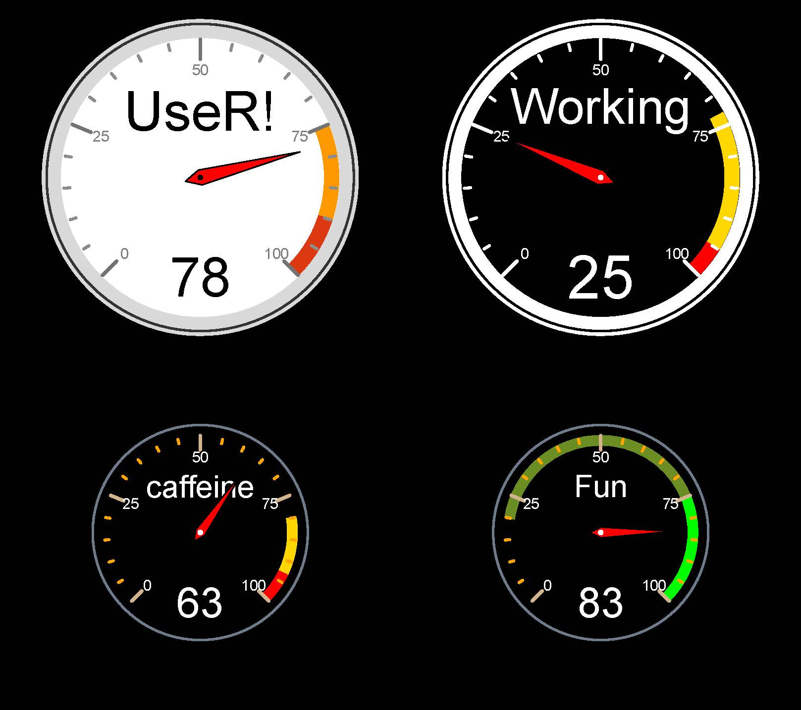
Dials and gauges
These are mostly used to indicate an accurate position on a curved axis and are helpful in making relative observations across independent variables.
-
Geographic maps
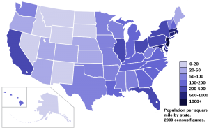
Graphic maps facilitate visualization with respect to metrics that are divided on the basis of geographic locations such as cities, states or countries – parameters may include literacy, age, population data etc. (the image at the beginning of this article represents population data across US states)
-
Tree maps
Tree maps display a set of nested rectangles in a tree-structured form, depicting each rectangle as a branch, while the smaller rectangles represent the sub-branches.
-
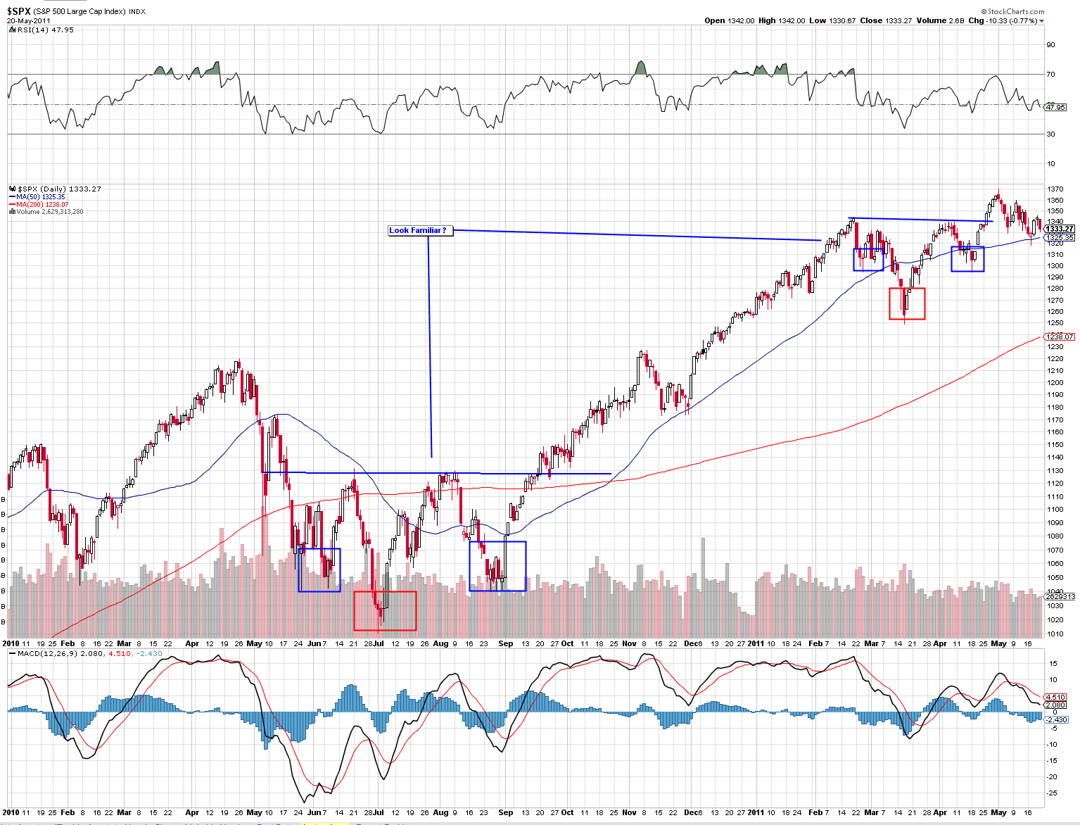
Fever/Time-series charts
The terms fever and time-series charts are often used interchangeably for a graphic representation that shows changes in one variable over a period of time. Charts that are used to map changes in stock prices are in the form of fever charts that allow a clear visual representation of change in measurement.
-
Heat map
These are two-dimensional pictorial representations where data is represented by colors. An example of these are the website heat maps which highlight the areas of a page scanned or clicked most frequently by users.
-
Sparklines
Sparklines are another form of time-series representation that are usually drawn without coordinates and represents an indicative shape of a trend or any other variation in measurements.
Graphics can help business people to notice things that they didn’t expect to see. Visualization opens up a means to harness data that can not be analyzed easily.
As big data becomes bigger, a larger number of companies will be compelled to deal with complex data sets which would become difficult to analyze without visualizing. Data visualization is often integrated into business intelligence (BI) dashboards that provide its users with a bird’s eye view of organizational information, various knobs and metrics, and key performance indicators (KPIs) to aid decision-making.