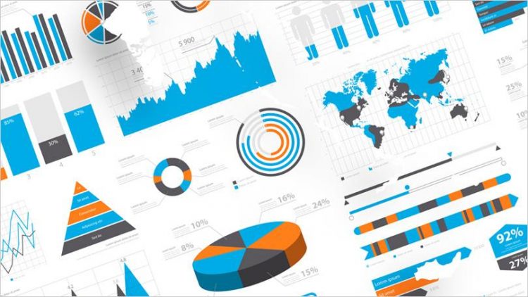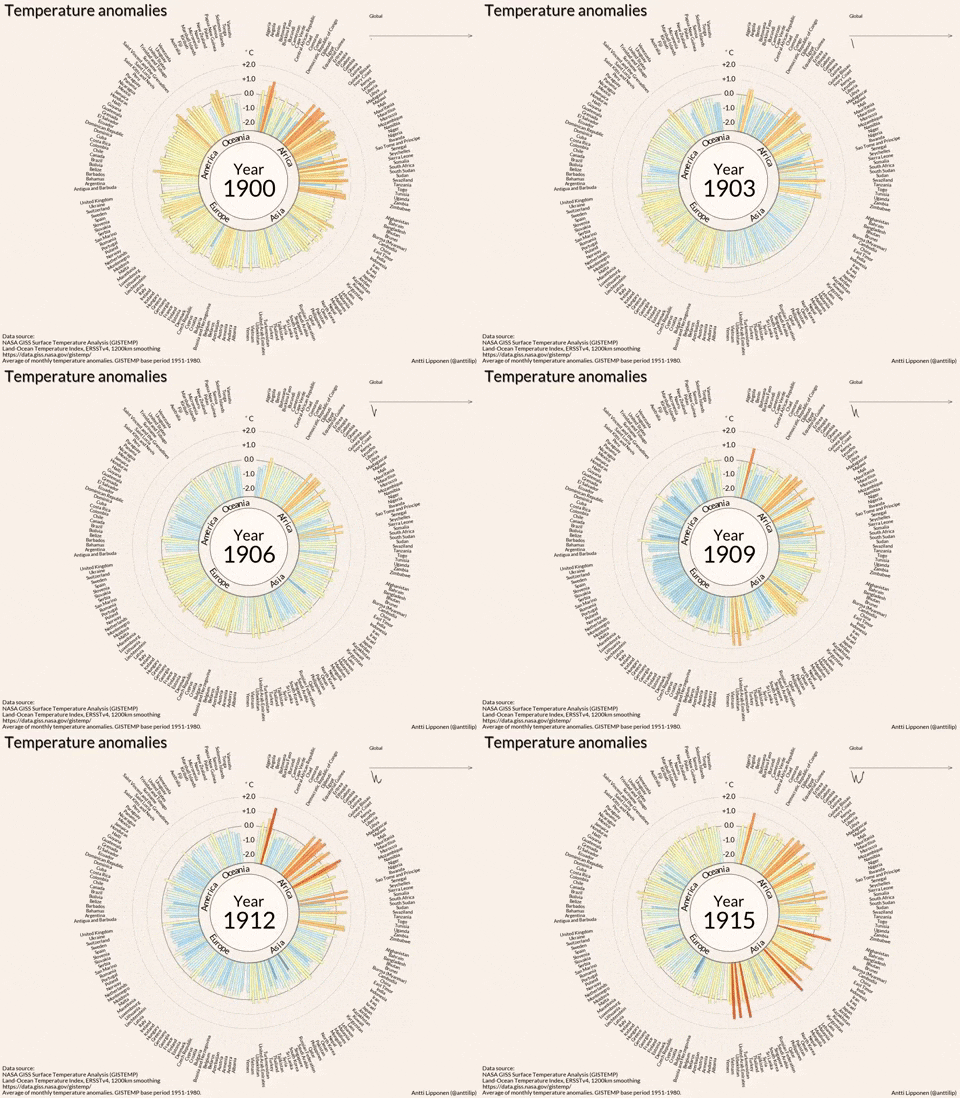
The humongous amounts of data available today is almost causing an information overload for anyone venturing into its analyses. This trend seems to be going nowhere since the data is only growing in size over time. Future of Data Visualization has been the most resourceful tool that’s been keeping this big data consumable for the stakeholders in a company who aren’t data savvy. Data is now easily scannable with the amazing prowess of data visualization which helps us understand complex patterns and analyze information.
Data visualization disintegrates big data into smaller chunks of information that’s easy to interpret. This has led to the proliferation of data visualization tools with varying capabilities that are available across platforms.
An engaging infographic, or interactive data visualization with appealing colors and striking patterns never ceases to impress. This blend of data and art is what makes today’s data visualization tools unique. Data visualization has been evolving at a fast pace over the last couple of years. To stay ahead of the pack, you must closely track the trends and adopt the new technologies that keep enriching the world of data visualization. Here are the new and upcoming trends that are making data visualizations more accessible to everyone.
Social-first data visualizations
Data visualization is going more social nowadays where it sees higher levels of engagement from followers. Data scientists too, having identified this trend are taking extra care to make Future of Data Visualizations social media-friendly. Since the attention span of social media users is very low, data must be presented to them in a visually attractive and intriguing way. Some examples of social first data visualizations include GIFs, looping animations and YouTube shorts.
Put simply, social first data visualizations are all about making the content snackable.
Mobile-first visualizations
This might sound a bit odd to many considering the limited screen real estate of a smartphone, however we are already doing many things that once seemed impossible on a phone but are commonplace now. If you look at the specifications of the modern day smartphones, it’s a no brainer that they are now extremely superior in computing power. The shift of internet users from desktop to mobile has clearly made a statement – mobile is the future.
For a world that’s obsessed with mobile consumer experience, we would soon witness innovations in mobile data visualization. Future of Data Visualization for mobile is gaining importance and many vendors are working on adapting desktop experiences to mobile formats to embrace the mobile-first approach. Consumer electronics giant Apple acquired Mapsense, a mobile data visualization startup for $30 million, this September.
Color trends
Color is a crucial component of visual design and data visualizations aren’t an exception. The Pantone Color Institute recently picked Greenery 15-0343 as the Color of the Year 2017. Greenery is symbolic of new beginnings, freshness and environmentalism.
As data visualizations are a blend of visual art and data, it would definitely reflect the trends and movements of color across the world. As per Digital Arts, there would be a rise in deep hues like olive green, khaki, maroon, charcoal grey and red brick.
Storytelling and narrative to become hot skills
The concept of data visualizations for storytelling is starting to gain popularity. Simply visualizing data just won’t cut it anymore and visualizers need to become narrators who can identify and bring deep insights to the forefront.
Just like a story, visualizations should have a good beginning, a solid middle and a powerful end. It should be a progression along with which the viewer can perceive seemingly insignificant but key specifics of the data. Highlighting data effectively using visualization is likely to become a skill in itself.
The concept will continue to spread as we progress towards 2018 and beyond. Now is the right time to lead the game by taking your readers on an interesting narrative experience.
Virtual and mixed reality
Virtual reality has the potential to revolutionize a multitude of industries. When it comes to presenting huge chunks of data in an way that everybody understands the key insights, a flat two dimensional screen isn’t the most effective medium. There is only so much that someone can perceive from a two-dimensional figure. However, with virtual reality, the perceiver is placed in the middle of a virtual space which is immersive and surrounded by data. You can check out this medium post to experience some of the most immersive virtual reality data visualizations.
Data journalism is going mainstream
With the availability of data and great tools to analyze and visualize it, we are seeing an increase in the number of incredible data visualizations released by the top media companies across the globe.
We will continue to see better and more effective use of data visualization in storytelling and news reporting especially from the popular newsrooms. The effectiveness and reach of data journalism is likely to convince more and more journalists to get a hang of using data to derive interesting news.
Artificial intelligence
Artificial intelligence is going to disrupt every domain and industry and there’s no doubt about it. Data visualization is certainly a crucial process for businesses and AI can lend a helping hand. With the data outgrowing the scope of our traditional dashboards and data scientists, the need for AI-based data visualization is almost at the peak. There is a lot of data nowadays and in it trapped are mission critical insights that can yield better results if extracted the soonest. Machine learning and natural language processing can work together to unveil critical insights from data, thereby reducing the data visualization workload for humans.
A machine learning system can be employed to compare graphs, identify anomalies, detect key insights and finally NLP can handle the communication part where the insights are to be put forward in simple and plain human language. Masses of data visualizations aren’t useful if they cannot be easily interpreted and AI has the potential to fix this.
Increasingly complex data sources
The quality and comprehensiveness of a data visualization will totally depend on the data that’s fed into it. With the recent technological advancements, it’s now possible to collect data using an unlimited array of methods, which puts us in touch with sophisticated data configurations.
This would mean better insights with more value can be derived and passed on to all those who are concerned. This also means that the data visualizers should carefully evaluate and choose the right data sources for achieving the right results.
Conclusion
With the increase in data available on multiple platforms, the challenge of visualizing it is definitely going to increase too. These new trends that are shaping up shows how Future of Data Visualization is evolving at a fast pace in order to cope with the ever-increasing data and business requirements. Extracting insights from data is definitely the ultimate function of data visualization and it can be enhanced by tapping into these emerging trends.


