


The role of data visualization in communicating the complex insights hidden inside data is vital. While data scientists and analysts have an eye for digging out the key insights from even complex visualizations, a top business stakeholder or an average person might not be able to do the same. And this is what makes effective data visualization the need of the hour. Communicating the data effectively is an art. However, many data scientists lag when it comes to the design and aesthetic aspects of visualizing data.
The r/dataisbeautiful subreddit on Reddit is a great place to find some curated data visualizations from around the web. Here are some of the key design principles for creating beautiful and effective data visualizations for everyone.
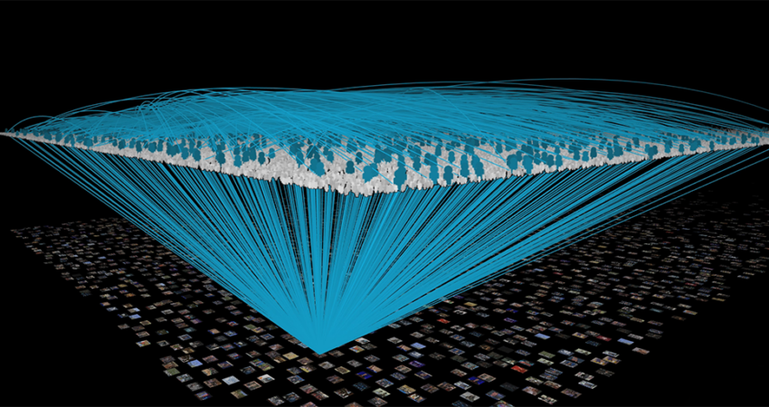
Effective Data Visualization with Eight Design Principles
1. Balance the Design
A balanced design is one with visual elements like shape, colour, negative space, and texture equally distributed across the plot. This does not necessarily mean the design should be an exact copy of the other. You can bring out an asymmetrical balance by offsetting bigger graphs and charts with smaller elements.
There are three different types of balances in design:
- Symmetrical–Each side of the visual is the same as the other
- Asymmetrical–Both sides are different but still have a similar visual weight
- Radial–Elements are placed around a central object which acts as an anchor
You will have to figure out which type of balance works the best for your data visualization and apply that.
2. Emphasise the Key Areas
The user’s attention should be drawn to the right data points by carefully choosing the size, colours, contrast, and negative space. The goal of the data visualization is to make sure that the important data doesn’t go unnoticed and emphasise it helps. Since the attention of a user first falls in the top-left corner of a plot, you should place the important data points there.
3. Illustrating Movement
Movement directs the user’s attention in a certain direction, just like emphasis. Your visual elements should mimic movement in an “F” pattern, which is how people read. Starting from top left to right, and gradually down the page.
You could also illustrate movement across the page by using complementary colours that can catch the viewer’s gaze and take it across the page. This principle is more applicable to static visualizations. If your data visualization tool is capable of animation and interactive designs, the movement aspect should already be covered.
4. Smart Use of Patterns
Repeated design elements form a pattern. When it comes to visualizing your data, patterns make for a great way to display similar types of information spread across the page as one. If the data on the page is too much for emphasizing, establishing a pattern by using similar colours, chart types and elements are the way to go.
Patterns also make it easier to communicate an anomaly, since any disruption in the pattern will naturally draw the viewer’s attention and curiosity. Using patterns is one of the simplest and most effective design principles when it comes to data visualization.
5. Proportion
If you are going to draw a picture of a bird on a tree, the tree will be significantly bigger compared to the bird. In data visualization, the proportion is made up of the size of each element on the page. Proportions in data visualization can indicate the weight of different data sets and the relationship between their values.
If you need to emphasize the importance of a certain data point, all you have to do is to make it bigger than the rest. In addition to this, you should ensure that the chart reflects the interrelationship of various numbers as accurately as possible. For example, if a slice in a pie chart is marked 36%, it should actually use 36% of the area inside the chart.
6. Proper Rhythm
Rhythm is a rather vague design principle that is closely associated with movement. A design is said to have a balanced rhythm when the design elements together create a pleasing movement to the eye. If the design elements like shapes, colours, or proportions together create a “choppiness”, you might want to rearrange them to facilitate smooth eye movement across the data.
7. Variety
Variety is an important factor that keeps viewers engaged and interested in your data. It’s all about finding ways to visualize your data using different and interesting design elements to avoid repetition. The result will be a data visualization which is not only eye-catching but also helps the viewer retain the information presented for longer.
8. Theme
A unified theme ensures every part of your design is consistent and follows a standard. This should happen naturally if you have taken care of the aforementioned design principles. You can incorporate a theme for your company or based on the niche of the visualization. This helps connect with the user on a deeper level and augments the visual design.
Effective Data Visualization
We’re now witnessing a massive explosion in the quantity of data and its applications. Data analytics and visualization are among the top use cases of big data and many businesses are bringing out interesting data visualizations for their internal business analyses as well as for media exposure. Data visualizations are also among the high performing content types for popular media sites nowadays. By following these basic design principles, analysts and reporting professionals can communicate the insights in their data more effectively, which translates into a win-win situation for the creators as well as consumers.