Did you know that Taylor Swift is the youngest person to single-handedly write and perform a number-one song on the Hot Country Songs chart published by Billboard magazine in the United States! She is particularly known for infusing her personal life into her music which has received a lot of media coverage. It would be interesting in analysing Taylor Swift’s song lyrics via exploratory analysis and sentiment analysis to find out various underlying themes.
Data Set for Analysing Taylor Swift’s Song Lyrics
Thanks to the amazing API exposed by Genius.com, we were able to extract the various data points associated with Taylor Swift’s songs.
We’ve selected only the six albums released by her and removed the duplicate tracks (acoustic, US version, pop mix, demo recording etc.). This resulted in 94 unique tracks with the following data fields:
- album name
- track title
- track number
- lyric text
- line number
- year of release of the album
[call_to_action title="Download the data set for free" icon="icon-download" link="https://app.promptcloud.com/users/sign_up?target=data_stocks&itm_source=website&itm_medium=blog&itm_campaign=dataviz&itm_term=ts-lyrics&itm_content=data-mining" button_title="" class="" target="_blank" animate=""]Sign up for DataStock via CrawlBoard and click on the 'free' category to download the data set![/call_to_action]
Goals
Our goal is to first perform exploratory analysis and then move to text mining including sentiment analysis which involves Natural Language Processing.
– Exploratory Analysis
- word counts based on tracks and albums
- time-series analysis of word counts
- distribution of word counts
– Text Mining
- word cloud
- bigram network
- sentiment analysis (includes chord diagram)
We’ll be using R and ggplot2 to analyze and visualize the data. Code is also included in this post, so if you download the data, you can follow along.
Exploratory Analysis
Let’s first find out the top ten songs with the most number of words. The code snippet given below includes the packages required in this analysis and finds out the top songs in terms of length.
[code language=”r”]
library(magrittr)
library(stringr)
library(dplyr)
library(ggplot2)
library(tm)
library(wordcloud)
library(syuzhet)
library(tidytext)
library(tidyr)
library(igraph)
library(ggraph)
library(readr)
library(circlize)
library(reshape2)
lyrics <- read.csv(file.choose())
lyrics$length <- str_count(lyrics$lyric,”S+”)
length_df <- lyrics %>%
group_by(track_title) %>%
summarise(length = sum(length))
length_df %>%
arrange(desc(length)) %>%
slice(1:10) %>%
ggplot(., aes(x= reorder(track_title, -length), y=length)) +
geom_bar(stat=’identity’, fill=”#1CCCC6″) +
ylab(“Word count”) + xlab (“Track title”) +
ggtitle(“Top 10 songs in terms of word count”) +
theme_minimal() +
scale_x_discrete(labels = function(labels) {
sapply(seq_along(labels), function(i) paste0(ifelse(i %% 2 == 0, ”, ‘n’), labels[i]))
})
[/code]
This gives us the following chart:
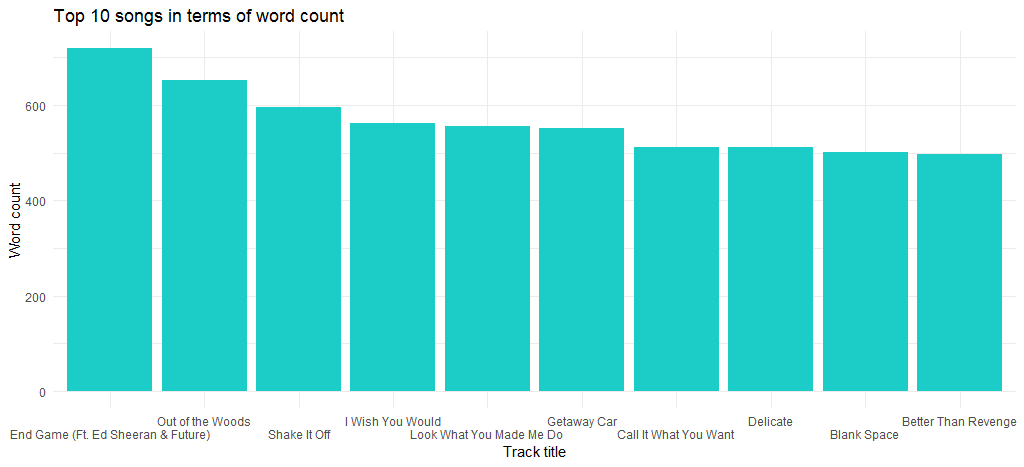
We can see that “End Game” (released in her latest album) is the song with the maximum number of words and next in line is “Out of the Woods”.
Now, how about the songs with the lowest number of words? Let’s find out using the following code:
[code language=”r”]
length_df %>%
arrange(length) %>%
slice(1:10) %>%
ggplot(., aes(x= reorder(track_title, length), y=length)) +
geom_bar(stat=’identity’, fill=”#1CCCC6″) +
ylab(“Word count”) + xlab (“Track title”) +
ggtitle(“10 songs with least number of word count”) +
theme_minimal() +
scale_x_discrete(labels = function(labels) {
sapply(seq_along(labels), function(i) paste0(ifelse(i %% 2 == 0, ”, ‘n’), labels[i]))
})
[/code]
This results in the following chart:
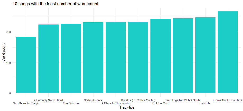
“Sad Beautiful Tragic” song which was released in 2012 as part of the album “Red” is the song with the least number of words.
The next data analysis is centered around the distribution of the number of words. Given below is the code:
[code language=”r”]
ggplot(length_df, aes(x=length)) +
geom_histogram(bins=30,aes(fill = ..count..)) +
geom_vline(aes(xintercept=mean(length)),
color=”#FFFFFF”, linetype=”dashed”, size=1) +
geom_density(aes(y=25 * ..count..),alpha=.2, fill=”#1CCCC6″) +
ylab(“Count”) + xlab (“Legth”) +
ggtitle(“Distribution of word count”) +
theme_minimal()
[/code]
This code gives us the following histogram along with a density curve:
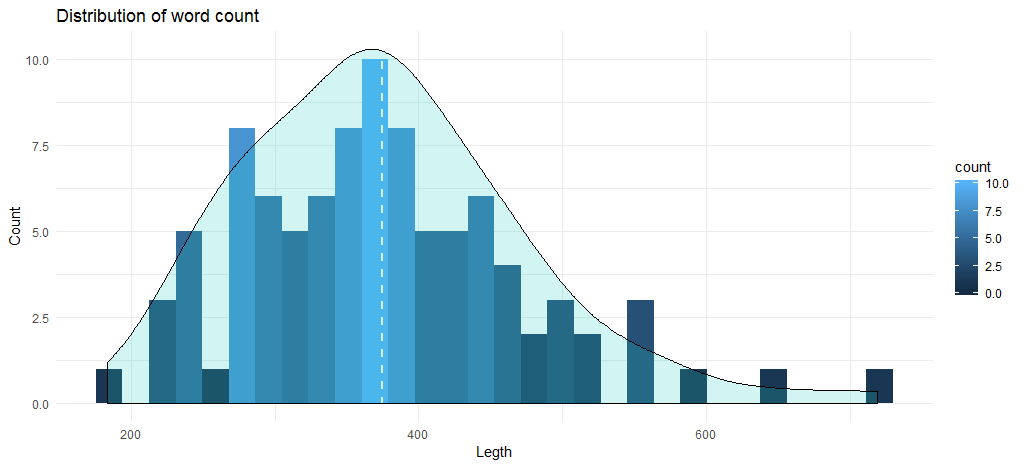
The average word count for the tracks stands close to 375, and and the chart shows that the maximum number of songs fall in between 345 to 400 words. Now, we’ll move to the data analysis based on albums. Let’s first create a data frame with word counts based on album and year of release.
[code language=”r”]
lyrics %>%
group_by(album,year) %>%
summarise(length = sum(length)) -> length_df_album
[/code]
The next step for us is to create a chart that will depict the length of the albums based on the cumulative word count of the songs.
[code language=”r”]
ggplot(length_df_album, aes(x= reorder(album, -length), y=length)) +
geom_bar(stat=’identity’, fill=”#1CCCC6″) +
ylab(“Word count”) + xlab (“Album”) +
ggtitle(“Word count based on albums”) +
theme_minimal()
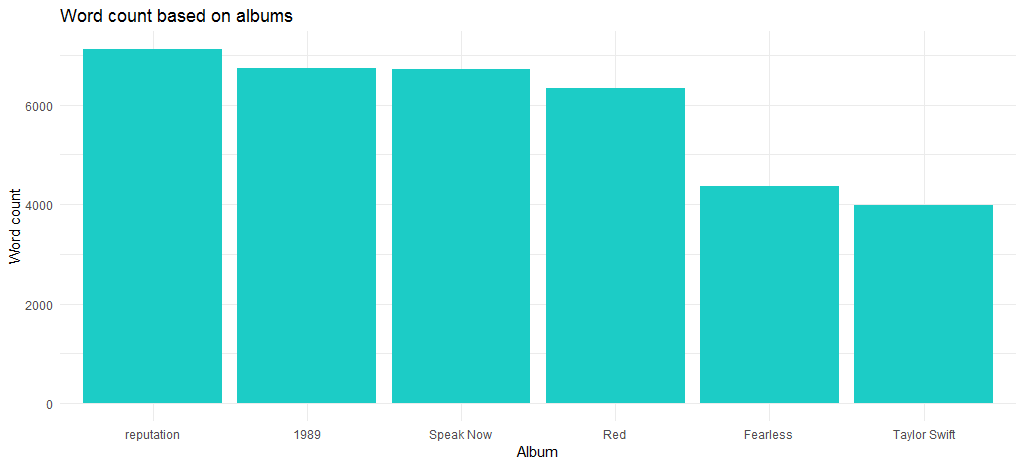
[/code]
The resulting chart shows that the “Reputation” album which is also the latest album has the maximum number of words.
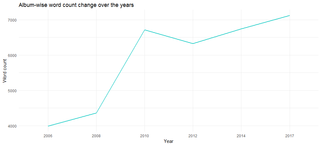
Now, how has the length of songs changed since the debut from 2006? The following code answers this:
[code language=”r”]
length_df_album %>%
arrange(desc(year)) %>%
ggplot(., aes(x= factor(year), y=length, group = 1)) +
geom_line(colour=”#1CCCC6″, size=1) +
ylab(“Word count”) + xlab (“Year”) +
ggtitle(“Word count change over the years”) +
theme_minimal()
[/code]
The resulting chart shows that the length of the albums have increased over the years — from close to 4000 words in 2006 to more than 6700 in 2017.
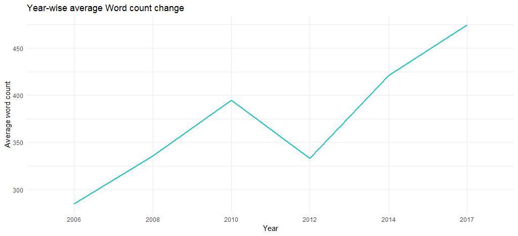
But, is that because of the number of words in individual tracks? Let’s find out using the following code:
[code language=”r”]
#adding year column by matching track_title
length_df$year <- lyrics$year[match(length_df$track_title, lyrics$track_title)]
length_df %>%
group_by(year) %>%
summarise(length = mean(length)) %>%
ggplot(., aes(x= factor(year), y=length, group = 1)) +
geom_line(colour=”#1CCCC6″, size=1) +
ylab(“Average word count”) + xlab (“Year”) +
ggtitle(“Year-wise average Word count change”) +
theme_minimal()
[/code]
The resulting chart confirms that the average word count has increased over the years (from 285 in 2006 to 475 in 2017), i.e., her songs have gradually become lengthier in terms of content.
We’ll conclude the exploratory analysis here and move to text mining.
Text Mining of Taylor Swift Songs’ Lyrics
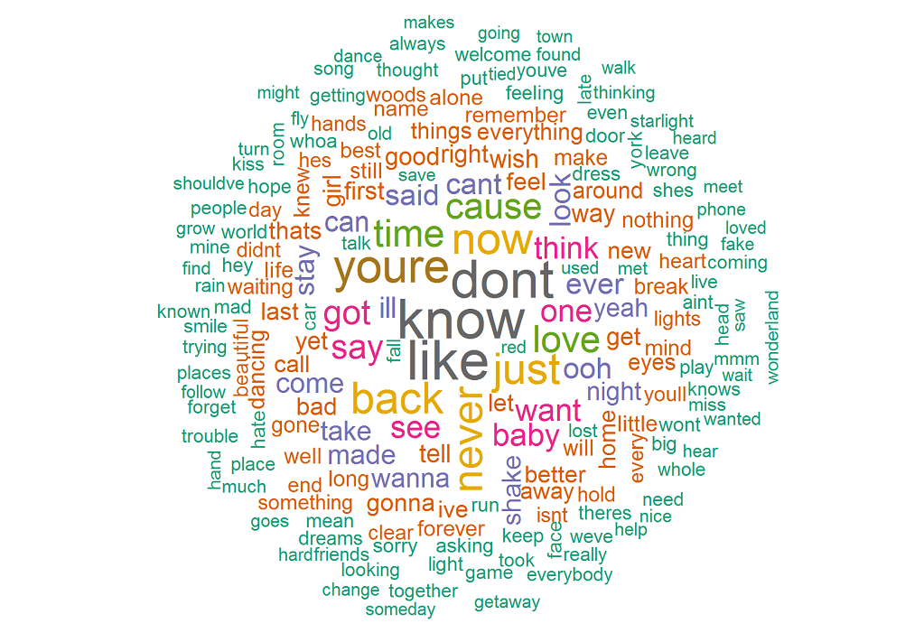
Our first activity would be to create a word cloud so that we can visualize the frequently used words in her lyrics. Execute the following code to get started:
[code language=”r”]
library(“tm”)
library(“wordcloud”)
lyrics_text <- lyrics$lyric
#Removing punctations and alphanumeric content
lyrics_text<- gsub(‘[[:punct:]]+’, ”, lyrics_text)
lyrics_text<- gsub(“([[:alpha:]])1+”, “”, lyrics_text)
#creating a text corpus
docs <- Corpus(VectorSource(lyrics_text))
# Converting the text to lower case
docs <- tm_map(docs, content_transformer(tolower))
# Removing english common stopwords
docs <- tm_map(docs, removeWords, stopwords(“english”))
# creating term document matrix
tdm <- TermDocumentMatrix(docs)
# defining tdm as matrix
m <- as.matrix(tdm)
# getting word counts in decreasing order
word_freqs = sort(rowSums(m), decreasing=TRUE)
# creating a data frame with words and their frequencies
lyrics_wc_df <- data.frame(word=names(word_freqs), freq=word_freqs)
lyrics_wc_df <- lyrics_wc_df[1:300,]
# plotting wordcloud
set.seed(1234)
wordcloud(words = lyrics_wc_df$word, freq = lyrics_wc_df$freq,
min.freq = 1,scale=c(1.8,.5),
max.words=200, random.order=FALSE, rot.per=0.15,
colors=brewer.pal(8, “Dark2”))
[/code]
The resulting word cloud shows that the most frequently used words are know, like, don't, you're, now, back. This confirms that her songs are predominantly about someone as you're has significant number of occurrences.
How about bigrams (word pairs that appear in conjunction)? The following code will give us the top ten bigrams:
[code language=”r”]
count_bigrams <- function(dataset) {
dataset %>%
unnest_tokens(bigram, lyric, token = “ngrams”, n = 2) %>%
separate(bigram, c(“word1”, “word2″), sep = ” “) %>%
filter(!word1 %in% stop_words$word,
!word2 %in% stop_words$word) %>%
count(word1, word2, sort = TRUE)
}
lyrics_bigrams <- lyrics %>%
count_bigrams()
head(lyrics_bigrams, 10)
[/code]
Given below is the list of bigrams:
| Word 1 | Word 2 |
|---|---|
| ey | ey |
| ooh | ooh |
| la | la |
| shake | shake |
| stay | stay |
| getaway | car |
| ha | ha |
| ooh | whoa |
| uh | uh |
| ha | ah |
Although we found out the word list, it doesn’t divulge any insight on several relationships that exist among words. To get a visualization of the multiple relationships that can exist we will leverage network graphs. Let’s get started with the following:
[code language=”r”]
visualize_bigrams <- function(bigrams) {
set.seed(2016)
a <- grid::arrow(type = “closed”, length = unit(.15, “inches”))
bigrams %>%
graph_from_data_frame() %>%
ggraph(layout = “fr”) +
geom_edge_link(aes(edge_alpha = n), show.legend = FALSE, arrow = a) +
geom_node_point(color = “lightblue”, size = 5) +
geom_node_text(aes(label = name), vjust = 1, hjust = 1) +
ggtitle(“Network graph of bigrams”) +
theme_void()
}
lyrics_bigrams %>%
filter(n > 3,
!str_detect(word1, “d”),
!str_detect(word2, “d”)) %>%
visualize_bigrams()
[/code]
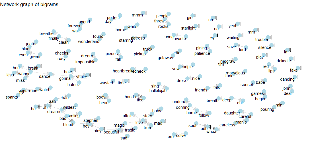
Check out the graph given below to see how love is connected with story, mad, true, tragic, magic and affair. Also, both tragic and magic are connected with beautiful.
Let’s now move to sentiment analysis which is a text mining technique.
Sentiment Analysis of Taylor Swift Songs
We’ll first find out the overall sentiment via the nrc method of the syuzhet package. The following code will generate the chart of positive and negative polarity along with associated emotions.
[code language=”r”]
# Getting the sentiment value for the lyrics
ty_sentiment <- get_nrc_sentiment((lyrics_text))
# Dataframe with cumulative value of the sentiments
sentimentscores<-data.frame(colSums(ty_sentiment[,]))
# Dataframe with sentiment and score as columns
names(sentimentscores) <- “Score”
sentimentscores <- cbind(“sentiment”=rownames(sentimentscores),sentimentscores)
rownames(sentimentscores) <- NULL
# Plot for the cumulative sentiments
ggplot(data=sentimentscores,aes(x=sentiment,y=Score))+
geom_bar(aes(fill=sentiment),stat = “identity”)+
theme(legend.position=”none”)+
xlab(“Sentiments”)+ylab(“Scores”)+
ggtitle(“Total sentiment based on scores”)+
theme_minimal()
[/code]
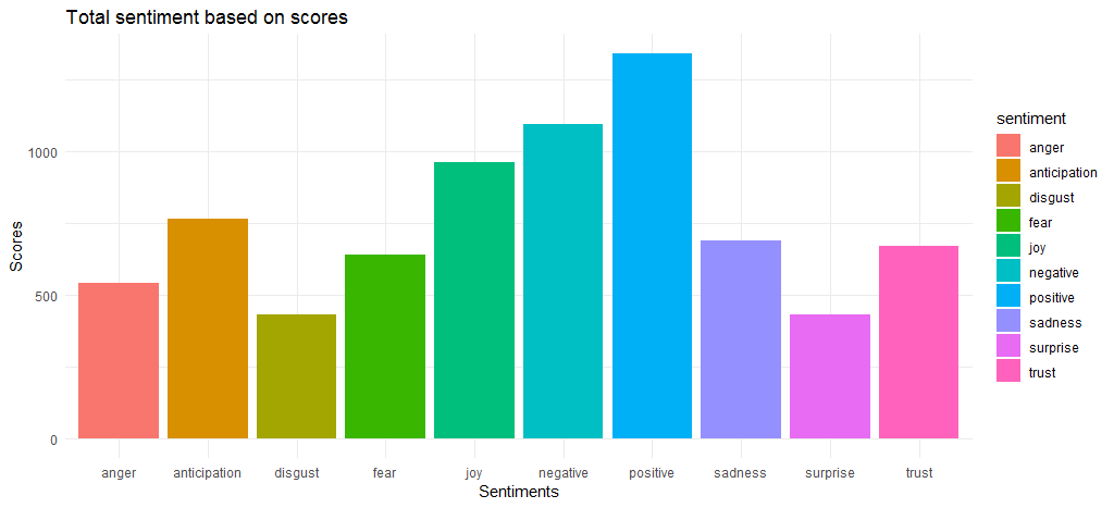
The resulting chart shows that the positive and negative sentiment scores are relatively close with 1340 and 1092 value respectively. Coming to the emotions, joy, anticipation and trust emerge as the top 3.
Now that we have figured out the overall sentiment scores, we should find out the top words that contribute to various emotions and positive/negative sentiment.
[code language=”r”]
lyrics$lyric <- as.character(lyrics$lyric)
tidy_lyrics <- lyrics %>%
unnest_tokens(word,lyric)
song_wrd_count <- tidy_lyrics %>% count(track_title)
lyric_counts <- tidy_lyrics %>%
left_join(song_wrd_count, by = “track_title”) %>%
rename(total_words=n)
lyric_sentiment <- tidy_lyrics %>%
inner_join(get_sentiments(“nrc”),by=”word”)
lyric_sentiment %>%
count(word,sentiment,sort=TRUE) %>%
group_by(sentiment)%>%top_n(n=10) %>%
ungroup() %>%
ggplot(aes(x=reorder(word,n),y=n,fill=sentiment)) +
geom_col(show.legend = FALSE) +
facet_wrap(~sentiment,scales=”free”) +
xlab(“Sentiments”) + ylab(“Scores”)+
ggtitle(“Top words used to express emotions and sentiments”) +
coord_flip()
[/code]
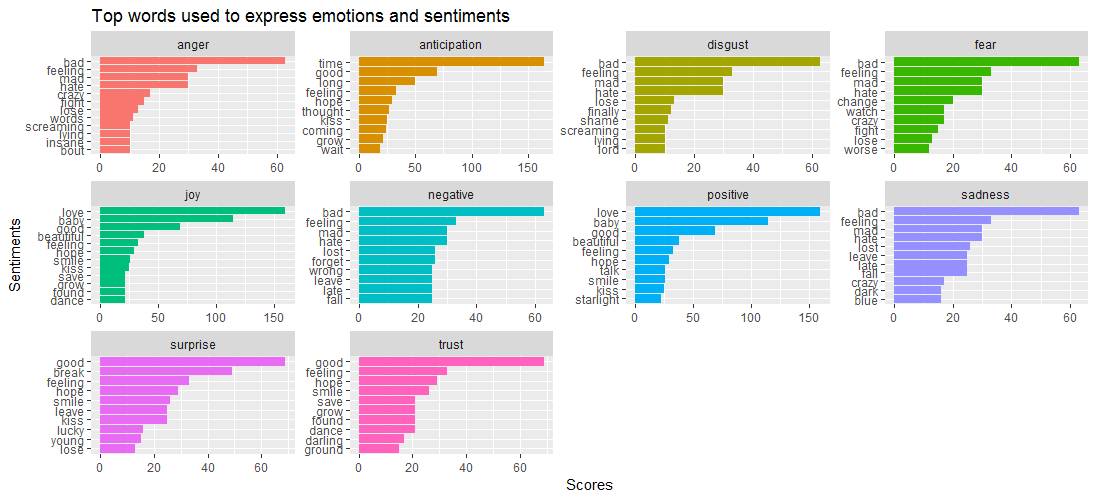
The data visualization given shows that while the word bad is predominant in emotions such as anger, disgust, sadness and fear, Surprise and trust are driven by the word good.
This brings to the following question – which songs are closely associated with different emotions? Let’s find out via the code given below:
[code language=”r”]
lyric_sentiment %>%
count(track_title,sentiment,sort=TRUE) %>%
group_by(sentiment) %>%
top_n(n=5) %>%
ggplot(aes(x=reorder(track_title,n),y=n,fill=sentiment)) +
geom_bar(stat=”identity”,show.legend = FALSE) +
facet_wrap(~sentiment,scales=”free”) +
xlab(“Sentiments”) + ylab(“Scores”)+
ggtitle(“Top songs associated with emotions and sentiments”) +
coord_flip()
[/code]
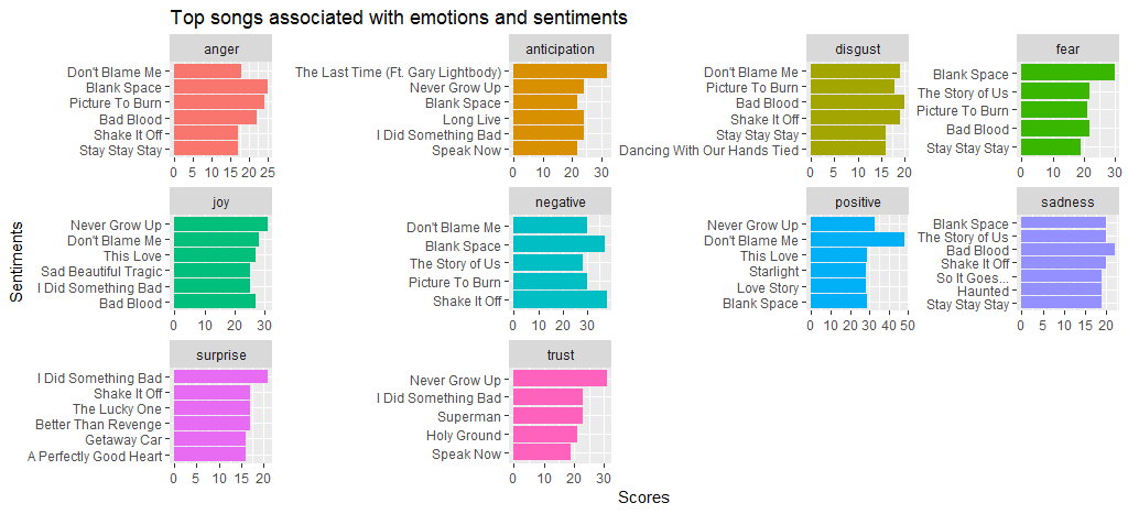
We see that the song Black Space has a lot of anger and fear in comparison to other songs. Don’t blame me because I have a considerable score for both positive and negative sentiment. We also see that Shake it off scores high for negative sentiment; mostly because of high frequency words such as hate and fake.
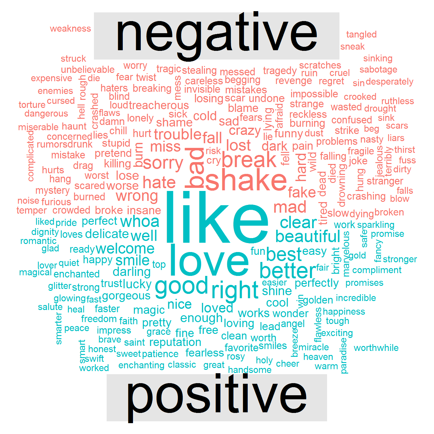
Let’s now move to another sentiment analysis method, bing to create a comparative word cloud of positive and negative sentiment.
[code language=”r”]
bng <- get_sentiments(“bing”)
set.seed(1234)
tidy_lyrics %>%
inner_join(get_sentiments(“bing”)) %>%
count(word, sentiment, sort = TRUE) %>%
acast(word ~ sentiment, value.var = “n”, fill = 0) %>%
comparison.cloud(colors = c(“#F8766D”, “#00BFC4”),
max.words = 250)
[/code]
Following data visualization shows that her songs have positive words such as like, love, good, right and negative words such as bad, break, shake, mad, wrong.
This brings to the final question – how has her sentiment and emotions changed over the years? For this particular answer we will create a visualization called chord diagram. Here is the code:
[code language=”r”]
grid.col = c(“2006” = “#E69F00”, “2008” = “#56B4E9”, “2010” = “#009E73”, “2012” = “#CC79A7”, “2014” = “#D55E00”, “2017” = “#00D6C9”, “anger” = “grey”, “anticipation” = “grey”, “disgust” = “grey”, “fear” = “grey”, “joy” = “grey”, “sadness” = “grey”, “surprise” = “grey”, “trust” = “grey”)
year_emotion <- lyric_sentiment %>%
filter(!sentiment %in% c(“positive”, “negative”)) %>%
count(sentiment, year) %>%
group_by(year, sentiment) %>%
summarise(sentiment_sum = sum(n)) %>%
ungroup()
circos.clear()
#Setting the gap size
circos.par(gap.after = c(rep(6, length(unique(year_emotion[[1]])) – 1), 15,
rep(6, length(unique(year_emotion[[2]])) – 1), 15))
chordDiagram(year_emotion, grid.col = grid.col, transparency = .2)
title(“Relationship between emotion and song’s year of release”)
[/code]
It gives us the following visualization:
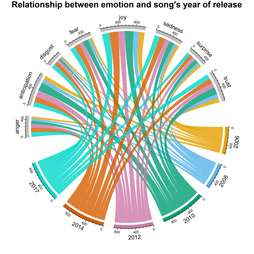
We can see that joy has a maximum share for the years 2010 and 2014. Overall, surprise, disgust and anger are the emotions with least score; however, in comparison to other years 2017 has maximum contribution for disgust. Coming to anticipation, 2010 and 2012 have a higher contributions in comparison to other years.
Over to You
In this study, we performed exploratory analysis and text mining, which includes NLP for sentiment analysis. If you’d like to perform additional analyses (e.g., lexical density of lyrics and topic modeling) or simply replicate the results for learning, download the data set for free from DataStock. Simply follow the link given below and select the “free” category on DataStock.

Frequently Asked Questions (FAQs)
How does the sentiment analysis of Taylor Swift’s lyrics compare across different albums?
The sentiment analysis of Taylor Swift’s lyrics across different albums suggests a nuanced exploration of her emotional and thematic evolution. By conducting a detailed sentiment analysis for each album, one could trace the shifts in emotional tone and thematic focus, revealing how personal experiences, artistic growth, and changes in the musical landscape have influenced her songwriting. This comparative analysis would highlight the diversity and depth of her lyrical content, showcasing her ability to convey a wide range of emotions and stories that resonate with a broad audience.
What methodologies were used to ensure the accuracy of the text mining and sentiment analysis?
To ensure the accuracy of text mining and sentiment analysis, various preprocessing and validation methodologies are crucial. Techniques such as stemming, lemmatization, and the removal of stop words help refine the text data, making it more amenable to analysis. Choosing appropriate algorithms and models, especially those adept at understanding the subtleties of natural language, is essential. The accuracy of these analyses can be further validated through cross-validation techniques, comparison with human-annotated sentiment benchmarks, or employing hybrid models that combine machine learning with rule-based elements to better capture the nuances of sentiment in lyrics.
Could the analysis be extended to include a broader range of Taylor Swift’s discography or compare her work with that of other artists?
Expanding the analysis to include Taylor Swift’s entire discography or comparing her work with other artists offers a broader perspective on her lyrical themes and sentiments. Such an extended analysis would provide a more comprehensive understanding of her artistic trajectory, highlighting how her songwriting has evolved over the years. Additionally, comparing Swift’s lyrics with those of other artists could uncover unique stylistic and thematic elements that distinguish her work, offering insights into her influence on contemporary music and her place within the broader cultural context. This comparative approach would not only enrich the understanding of Swift’s artistry but also contribute to the larger discourse on music and emotion, illustrating the power of lyrics in shaping listeners’ experiences and perceptions.