


With stunning visualizations emerging frequently, 2017 was truly an exceptional year for visualization and data lovers — right from Cassini satellite to solar eclipse, to the effect of cultures on graphics.
In this post we have compiled 10 best data visualization projects that made their mark in 2017. They are in no particular order and have been sourced from popular internet communities, visualization award programs and other top media outlets. Read on learn more about the state of the world we live in.
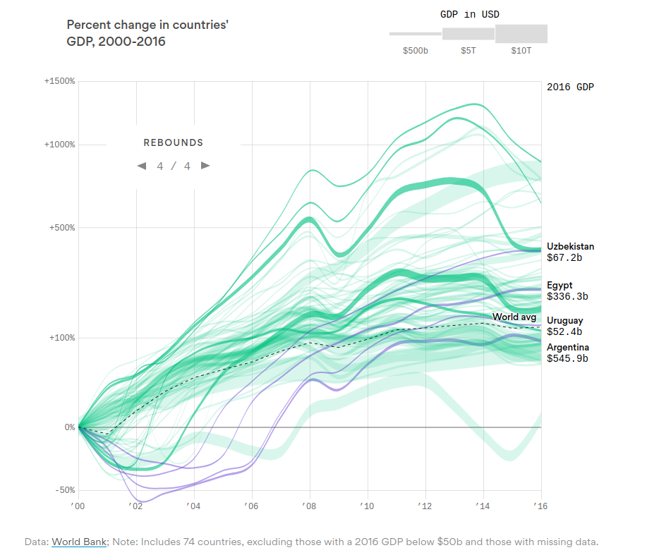
1) World’s GDP Growth
This visualization by Axios tracks 74 economies of the world and shows the GDP growth from 2000. For instance, it is interesting to compare the economy of Angola and Japan. The former has grown nearly 13 times while the later’s growth was stagnated (which was initially propelled by automobile and electronics industry).
2) My Eyes Hurt
This visualization was created by Reddit user ‘superpaow’ to showcase the after-effect of the full solar eclipse on the Americans. Right after the planetary event, the Reddit user used Google trends to visualize data related to search popularity of the terms “solar eclipse” and “my eyes hurt” in New York state on the day of the eclipse. We can see that there is swift surge for search term “my eyes hurt” which is can correlated with the event.
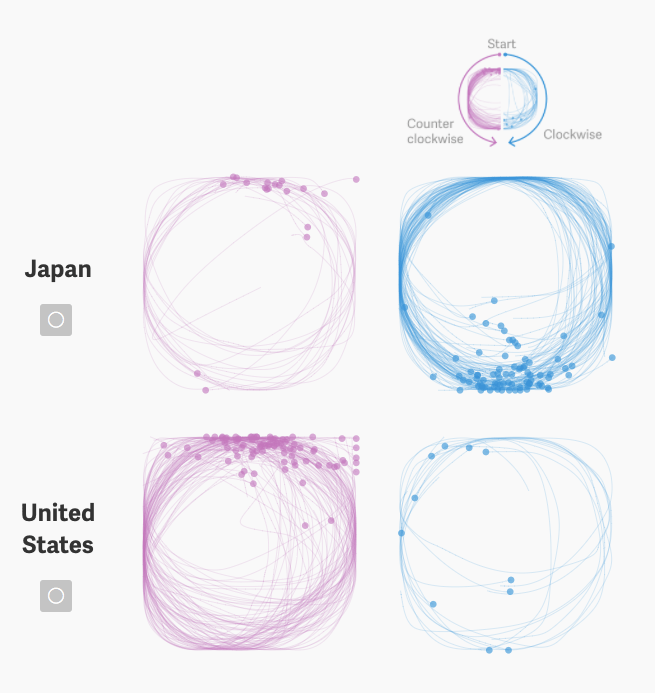
3) Cultural Expression in Graphics
Google’s game Quick, Draw! has attracted millions of people and they have submitted more than 50 millions drawings till now. This data visualization project focuses on the effect of the demographics (location, language, etc.) on the way we draw. Considering circles as a symbol that cuts across the global culture, Nikhil Sonnad and Thu-Huong Ha of Quartz analyzed the dataset of 119,000 circles to establish the link between drawing and nationality.
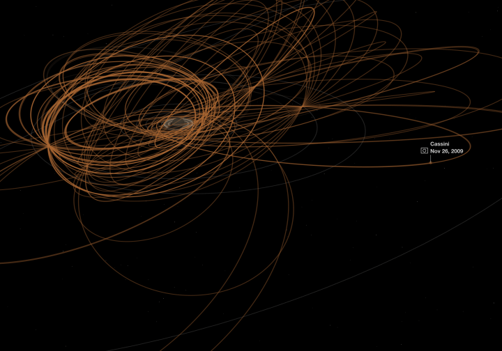
4) Cassini Grand Tour
Cassini was launched in 1997 with a mission to explore Saturn, and it ended on Sept. 15, 2017 with a planned plunge into Saturn’s atmosphere. This data visualization by National Geographic shows its journey and what it transmitted to the earth. You can also check out the unprocessed images.
5) People Killed in Terrorist Attacks in 2017: Europe (Blue) vs Africa (Red)
Reddit user valouhhh’s hard-hitting, yet simple visual depicts the number of people who died in terrorist attacks in Africa and Europe within January to October, 2017 time period. This clearly shows the way media covers world news — although Africans are the ones who bear the consequences of the militant extremism, outlets from US and Europe don’t necessarily show the perils to which the unprotected people are exposed.
People killed in terrorist attacks in 2017: Europe (Blue) vs Africa (Red) [OC] from dataisbeautiful
6) Rhythm of Food
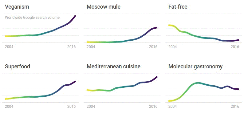
Google News Lab and Truth & Beauty leveraged Google search interest to uncover key insights on food trends over the years. The dataset was created by pulling weekly Google Trends data for hundreds of dishes and ingredients, over twelve years and plotted on a year clock to showcase how seasons and the rhythm of food function.
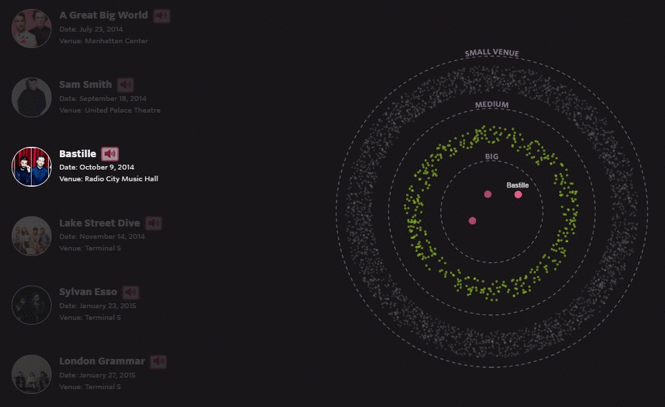
7) Making it Big
As per the data from the music event website Songkick, 7,000 bands headlined a small venue (less than 700 capacity) in the NYC area in 2013 and less than 50% performed in another show from 2014 to October of 2016. Finally only 21 managed to play at a venue of over 3,000 capacity — a benchmark considered for “making it big”. This interactive visualization shows some of the successful bands and the way they hit it big.
8) The Review Index
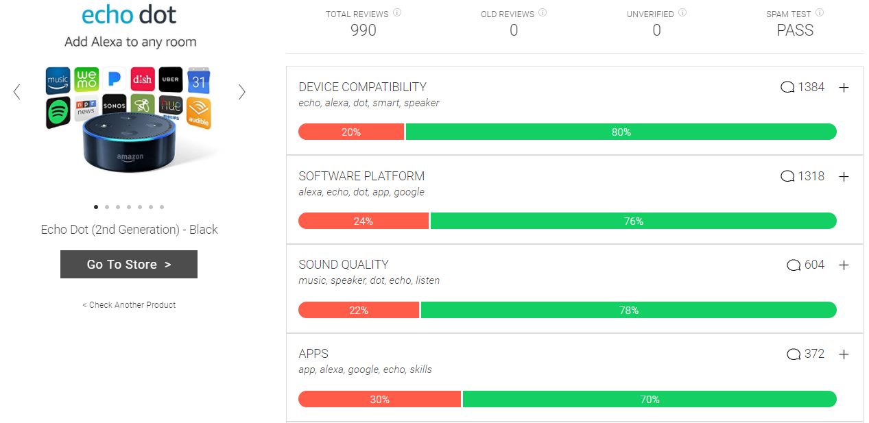
For those who find reading reviews on sites like Amazon difficult and time consuming, this project can be a great alternative. This project uses Neural Networks to detect and quantify recurring patterns in reviews, allowing us to go through thousands of reviews in a few minutes. Apart from that the network is capable of detecting spam and fake reviews so that consumers can take informed decision.
Just enter URL of the product and you would be presented with a simple data visualization depicting positive and negative score for various factors based on the reviews.
9) The Pudding
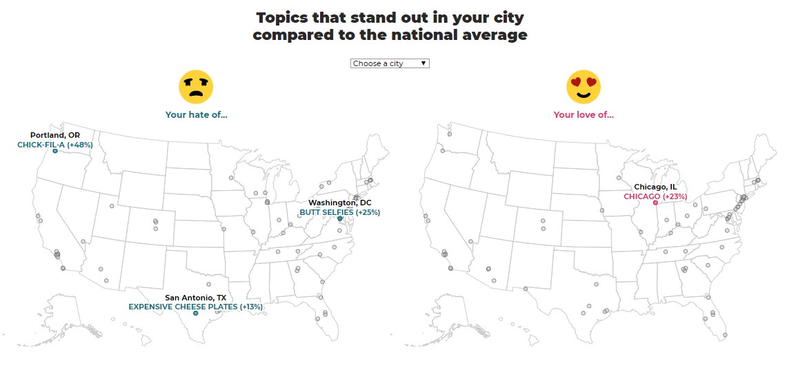
The Pudding stems from the concept of the explaining debated ideas with visual essays. By using original datasets, primary research, and interactivity, they apply this new form of journalism to explain complex topics.
A picture is worth a thousand words, and these type of visual essays make storytelling interesting and more accessible. This project would definitely spark
10) Data Sketches
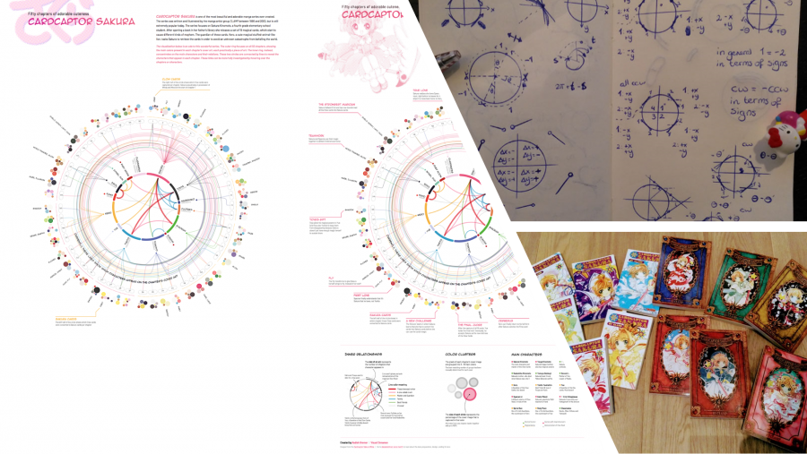
This project was started by Nadieh Bremer and Shirley Wu. Each month they select a topic and the assigned person works on the project to create an unconventional and interactive data visualization.